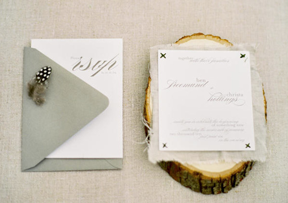
Hip hip hooray, I can finally show you our gorgeous wedding invites. TA DAH!
Like our wedding website, our invitations were designed by creative maven/ illustrator extraordinaire Tabitha Emma (but you probably guessed that, right?) and I’m seriously so happy with how they came up.
The Creative Process
When I was talking to Tabitha initially she asked me to tell her a bit about “Rach and Ramai” so she could get some ideas on the direction we’d like to go with the invites, so I told her we’re often branded ‘R & R’ – hence the monogram – and that we love natural, rustic elements, which she took into consideration when coming up with the design.
I also shared my love of calligraphy-style type and native flowers, in particular King Proteas, and was delighted to see them included in her illustrations when she sent through the first concepts!
(It would be remiss of me not to mention here that Tabitha is an absolute dream to work with, can’t recommend her enough).
Assembling the Invites
I’ve always loved the mix of white and brown (wood/ hessian) and I wanted to give the brown kraft envelopes a bit of a “lift”, so I added a paper doily to each at the top to make the envelopes a bit special.
Let me tell you, spray adhesive is your friend if you’re thinking of doing something similar (I also managed to get it all over the carpet – hello sticky feet!)
Photos are OK, but you really need to see these “in real life” to get a proper idea – the paper stock is divine and has a bit of texture through it. It’s the perfect thickness, and Tabitha had sent me some samples prior to our invites going to print so I knew what the end result would be like which is always nice.
Finally, I haven’t shown it in these shots, but after tossing up whether to get a calligrapher to address the envelopes, we took an easier (and just as beautiful) route and used the stunning Carolyna font.
The RSVP card and the invite were tied together with some twine I picked up at Mark Tuckey Home in Avalon and we used Australia Post’s ‘Special Occasion’ stamps (vintage brown roses/ wedding ring images) on the outer envelope and on the RSVP card, which was designed to be like a postcard. Easy for guests to just pop in the mail and send back.
And that’s about it!
+ I’d love to know: what do you think? I know there are a whole bunch of stationery nerds amongst us, so please leave your thoughts below in the comments.
+ Also, feel free to share this post with your lovely bride-to-be friends or Pin the images using the button below. Spread the love around!


